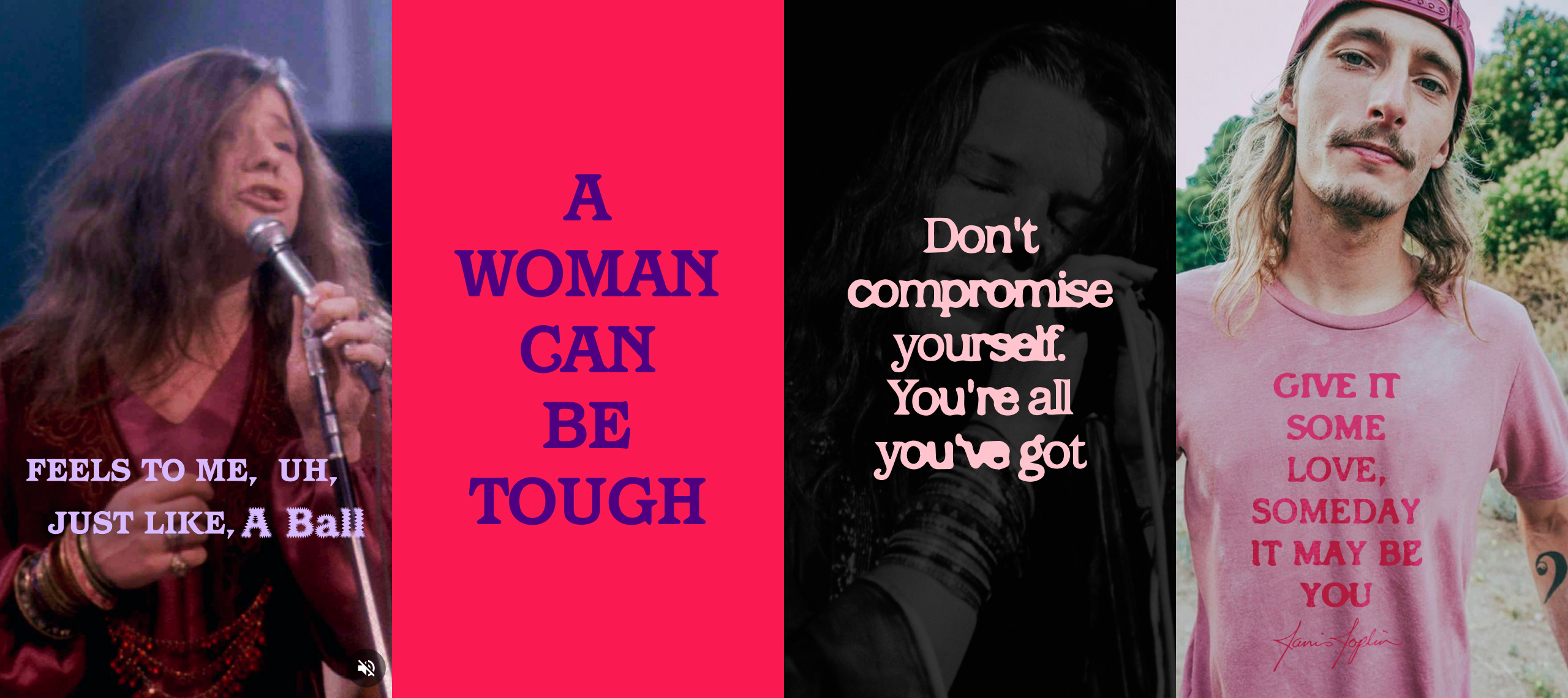
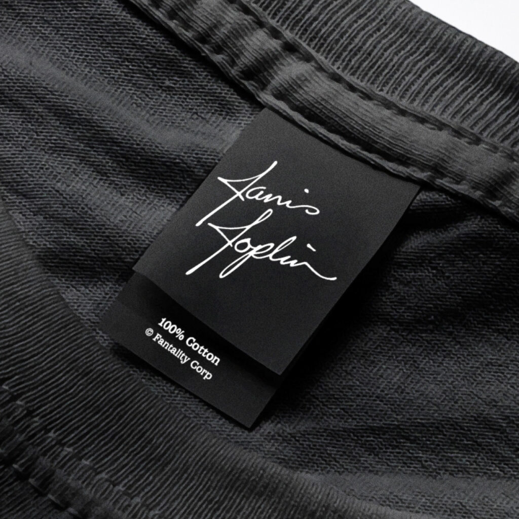
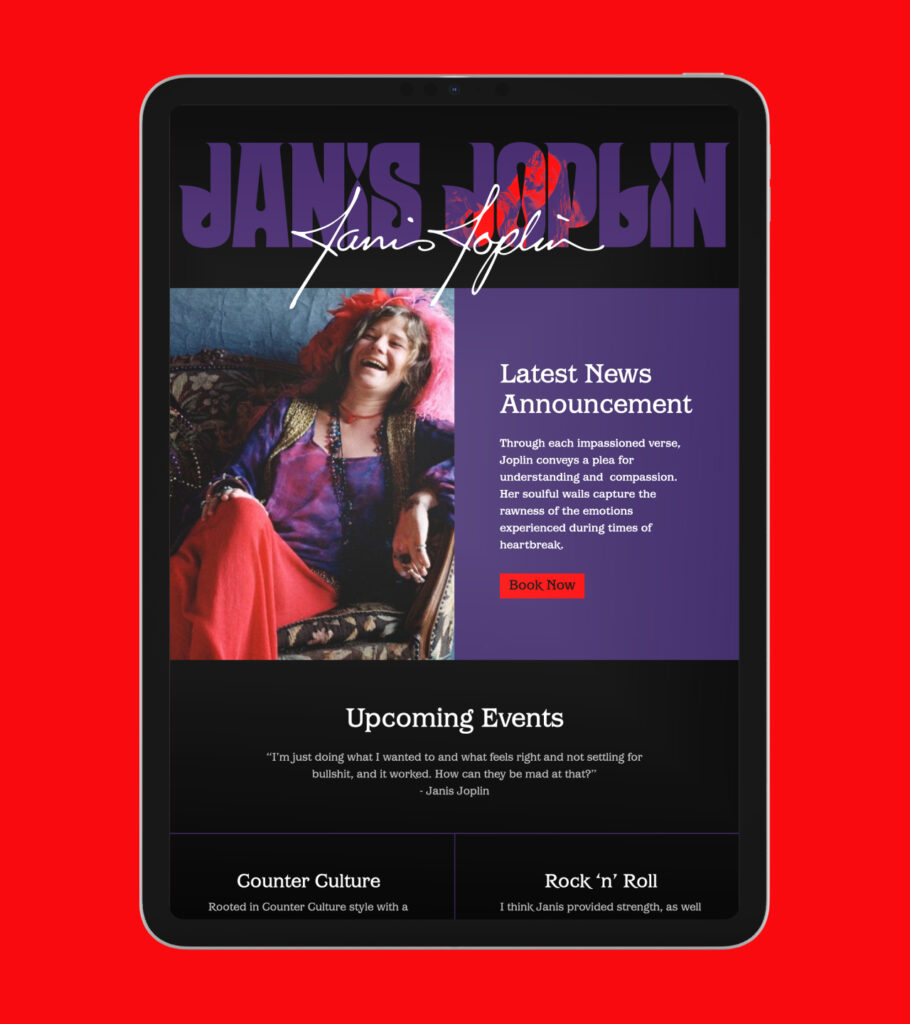
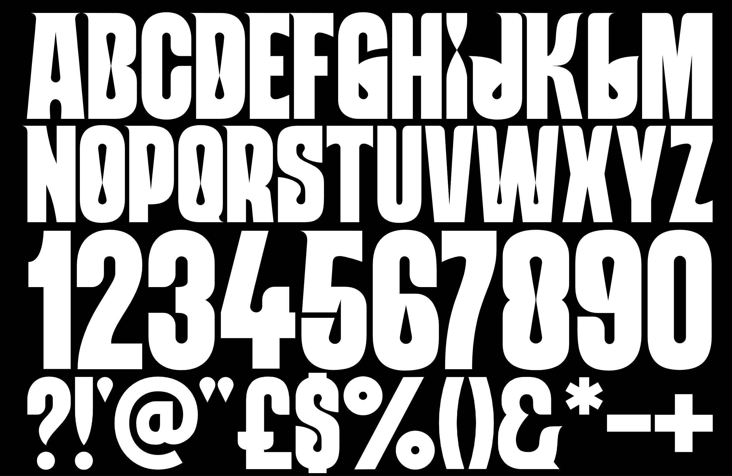
How do you create a cohesive visual identity for a legendary artist that engages new audiences and appeals to existing fans?

Working closely with The Creative Corporation, we instigated an exploration into what made Janis... well, Janis. The work honours her raw spirit and cultural impact while creating a cohesive brand language that resonates across digital platforms, physical product and moving image.

Like many legacy artists, Janis' identity was a collection of past sleeves, videos and posters, and fan art.

The key to this project was not to derive visuals from well-trodden visual tropes of the sixties counter-culture, but to really understand what drove Janis as an artist and a human being.

How could we visually convey the tension between her powerful voice and performances and the fragility underpinning the emotional content of her work, and frame that within the free spirit of the culture she helped define.

Driving the visual aesthetic was a custom-designed logotype and typeface inspired by the organic shapes of art nouveau, itself an influence for counterculture art, and included details from Janis’ own handwriting.

Rendered as a solid or outline font, it manifests the power and fragility we were looking to convey.

The rebrand is now rolling out across Janis Joplin’s digital platforms, anchored by a redesigned website, SEO strategy and e-commerce store that brings together her full catalogue, iconic photography and landmark moments - all presented through a bold, contemporary lens.

A result of the brand overhaul is a 120% increase in website traffic and significantly increased sales of Janis product and merch via the offical store.