
Cave Painting Album Campaign
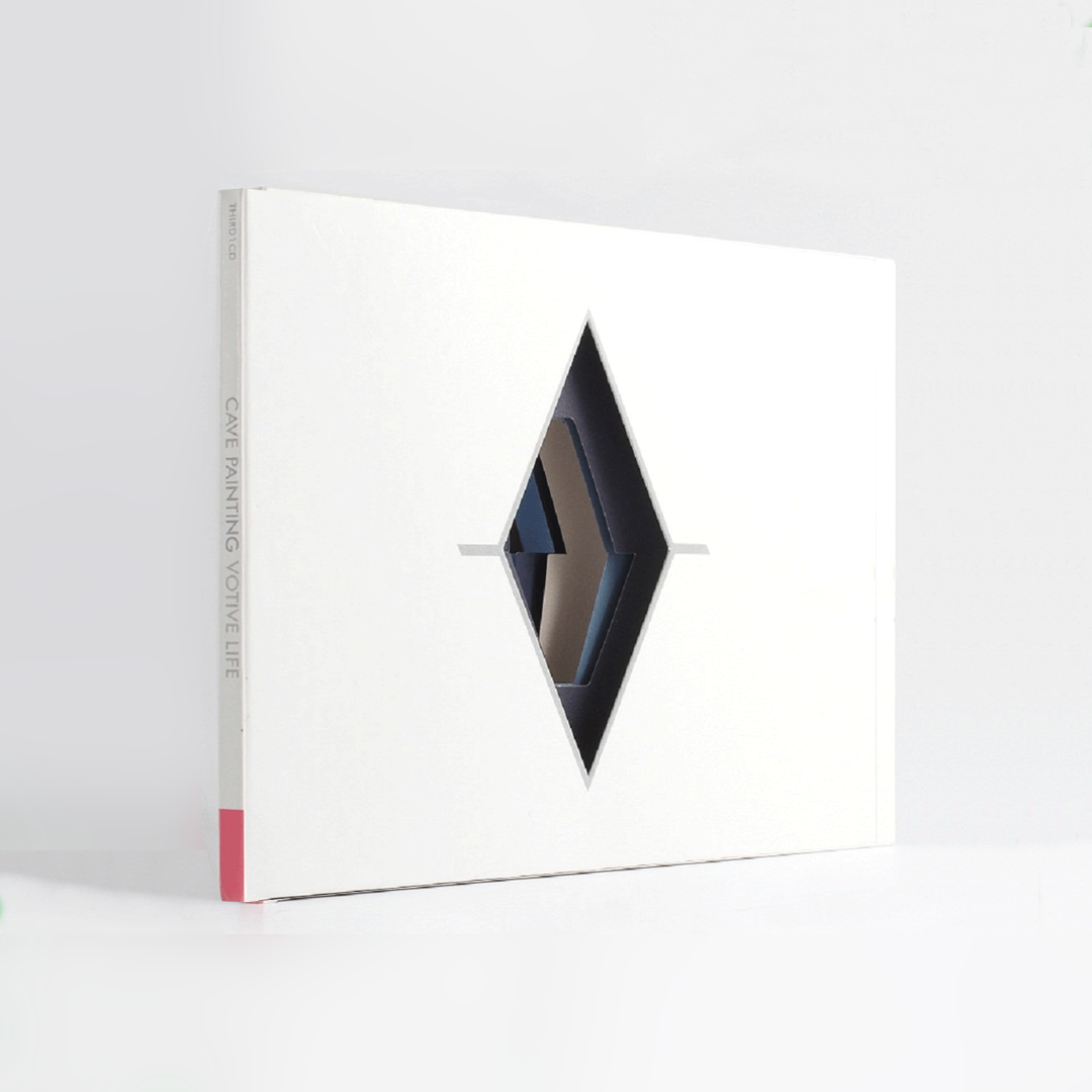
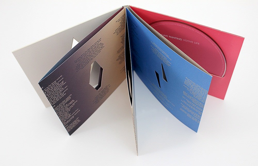
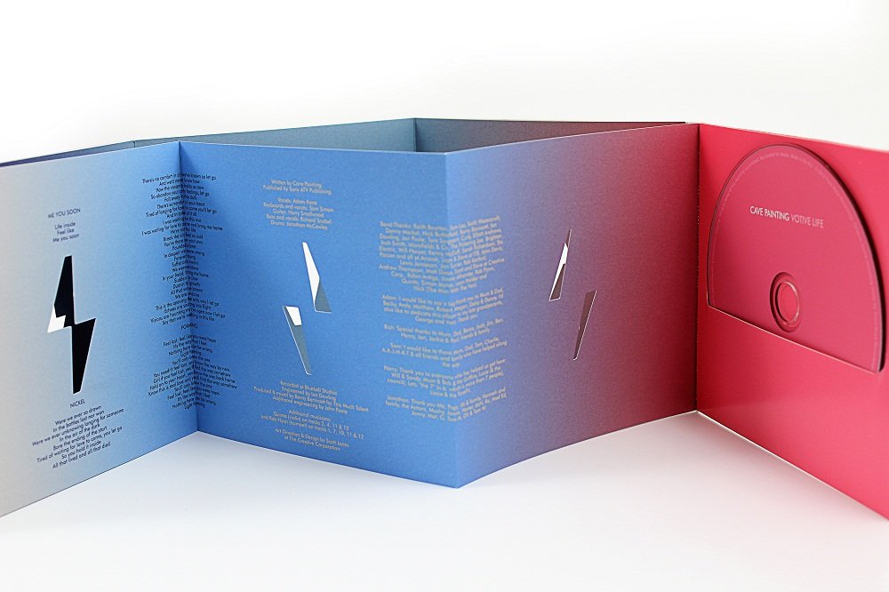
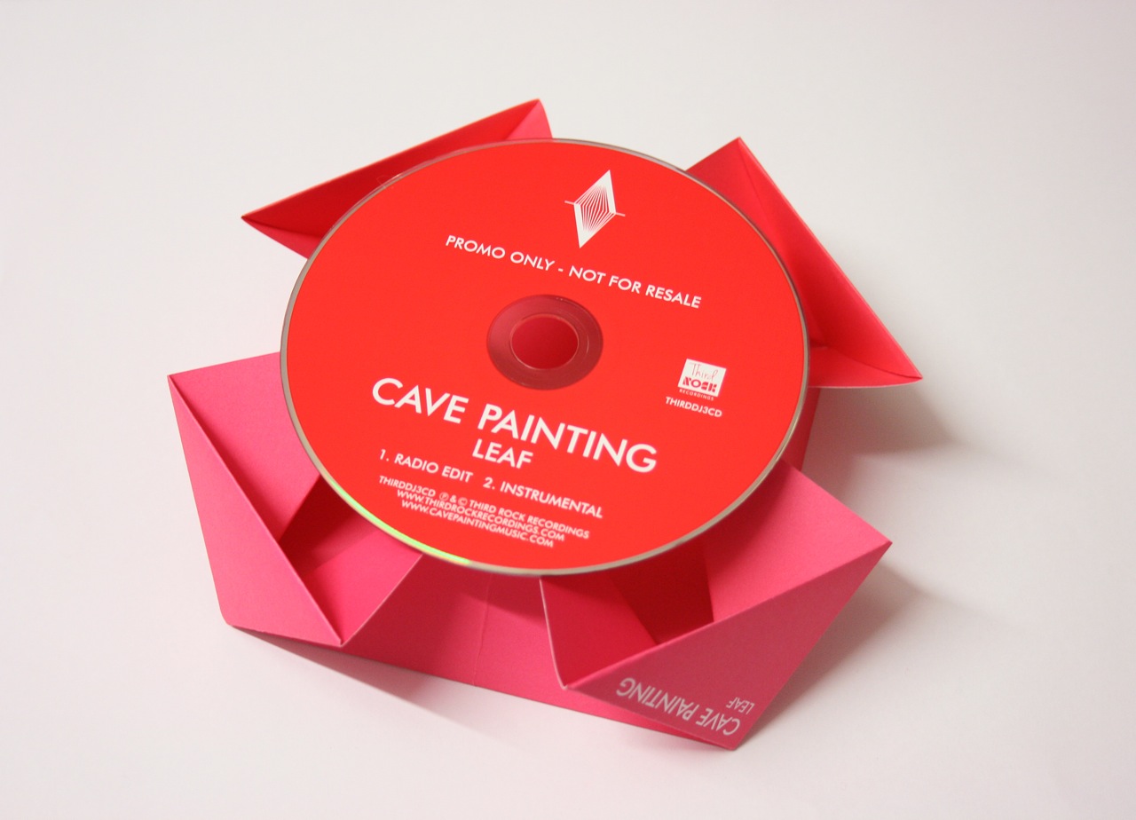
While Creative Director at the Creative Corporation, I conceived and art-directed the packaging for Cave Painting’s debut album, Votive Life.
Heavily influenced by Japanese binding techniques, I developed the symbol supplied by the band and incorporated it into various die-cut shapes throughout the book, which when assembled produced a multi-layered version of the band’s symbol.
The vinyl version also utilised die-cutting techniques to produced an animation-like effect when the inner sleeve was slid out by the listener.
Featured in Creative Review’s record sleeves of the month.
